Implementing Multiple Themes in MUI: Light, Dark, Custom, with SSR Support
Table of Contents

Introduction #
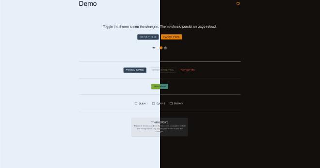
In this article, you’ll learn how to integrate multiple themes with Material-UI (MUI) in your Next.js applications while supporting server-side rendering (SSR). This approach ensures your app is optimized for performance and SEO. The tutorial is also fully compatible with React.js client-side applications, making it versatile for different project setups.
MUI is a leading React component library, offering customizable components and themes for building beautiful, responsive web apps. By implementing multiple themes, you empower users to switch between styles, enhancing their experience while maintaining flexibility for your app’s architecture.
Why Use MUI’s Theme System? #
Unified and Flexible Design #
MUI’s ThemeProvider simplifies theme management across your application. A theme defines global properties—like colors, typography, and layouts—that ensure design consistency. Centralizing these properties makes it easy to update and extend your app’s look.
Built-in Light and Dark Mode #
MUI enables effortless toggling between light and dark modes based on system preferences or user settings. This modernizes your app’s UI and improves accessibility.
Optimized for SSR with Next.js #
MUI integrates seamlessly with Next.js, ensuring the correct theme is applied during the initial server render. This eliminates:
- Layout shifts caused by theme mismatches during hydration.
- Theme flickering for a polished and professional look.
For flicker prevention, see the Dark Mode Flicker Guide
Customization for Unique Experiences #
In addition to light and dark modes, MUI allows you to create entirely custom themes tailored to your brand or user preferences. By defining multiple themes in your application, such as seasonal or context-specific themes, you can provide a dynamic, personalized user experience.
By leveraging MUI’s theme system, you can build beautiful, consistent, and responsive designs that scale effortlessly while keeping your development workflow efficient.
Step-by-Step Guide #
-
Create a Theme Context
Start by creating a context to manage global theme switching.
 1
 2
 3
 4
 5
 6
 7
 8
 9
10
11
12
13
14
15
16
17
18
19
20
21
22
23
24
25
26
27
28
29
30
31
32
33
34
35
36
37
38
39
40
41
42
43
44
45
46
47
48
49
50
51
52
53
54
55
56
57
58
59
60
61
62
63
64
65
66
67
68
69
70
71
72
73
74
75
// ThemeProviderWrapper.tsx import { createContext, ReactNode, useContext, useState } from "react"; import { createTheme, ThemeProvider, Components, } from "@mui/material/styles"; // Define themes const themes = { secondTheme: createTheme({ colorSchemes: { dark: { palette: { // Custom palette for secondTheme dark theme // https://mui.com/material-ui/customization/palette/#color-schemes }, }, light: { palette: { // Custom palette for secondTheme light theme }, }, }, }), default: createTheme({ colorSchemes: { dark: { palette: { // palette for default dark theme }, }, light: { palette: { // palette for default light theme }, }, }, }), }; export type Theme = keyof typeof themes; type ThemeContextType = { theme: Theme; setTheme: (theme: Theme) => void; }; const ThemeModeContext = createContext<ThemeContextType>({ theme: "default", setTheme: () => {}, }); export const useThemeContext = () => useContext(ThemeModeContext); type ThemeProviderWrapperProps = { children: ReactNode; }; const ThemeProviderWrapper = ({ children, }: Readonly<ThemeProviderWrapperProps>) => { const [theme, setTheme] = useState<Theme>("default"); return ( <ThemeModeContext.Provider value={{ theme, setTheme }}> <ThemeProvider theme={themes[theme]} defaultMode="dark"> {children} </ThemeProvider> </ThemeModeContext.Provider> ); }; export default ThemeProviderWrapper; -
Wrap Your Application
Wrap your app in
ThemeProviderWrapperto enable global theming.1 2 3 4 5 6 7 8 9 10 11 12 13 14 15 16 17 18 19 20 21 22 23 24 25 26 27// layout.tsx import "./globals.css"; import { Box, CssBaseline, StyledEngineProvider } from "@mui/material"; import ThemeProviderWrapper, { Theme } from "@/theme/ThemeProviderWrapper"; import { AppRouterCacheProvider } from "@mui/material-nextjs/v15-appRouter"; import InitColorSchemeScript from "@mui/material/InitColorSchemeScript"; export default async function RootLayout({ children, }: Readonly<{ children: React.ReactNode; }>) { return ( <html lang="en" suppressHydrationWarning> <body className={inter.className} suppressHydrationWarning> <AppRouterCacheProvider options={{ enableCssLayer: true }}> <ThemeProviderWrapper> <CssBaseline /> <InitColorSchemeScript attribute="class" /> {children} </ThemeProviderWrapper> </AppRouterCacheProvider> </body> </html> ); } -
Add a Theme Toggle Button
Allow users to switch between themes with a toggle.
1 2 3 4 5 6 7 8 9 10 11 12 13 14 15 16 17 18 19 20 21 22 23 24 25 26 27 28 29 30 31 32 33// ThemeToggle.tsx import { Box, IconButton, Button, Switch } from "@mui/material"; import { useThemeContext } from "@/theme/ThemeProviderWrapper"; const ThemeToggle = () => { const { theme, setTheme } = useThemeContext(); const toggleTheme = (theme) => { setTheme(theme); }; return ( <Box sx={{ display: "flex", flexDirection: "column" }}> <Box sx={{ display: "flex" }}> <Button onClick={() => toggleTheme("default")}>Default Theme</Button> <Button onClick={() => toggleTheme("sunrise")}>Sunrise Theme</Button> </Box> <Box sx={{ display: "flex", alignItems: "center" }}> <LightModeOutlinedIcon /> <Switch checked={mode === "dark"} onChange={() => setMode(mode === "dark" ? "light" : "dark")} name="theme" inputProps={{ "aria-label": "toggle theme" }} /> <DarkModeOutlinedIcon /> </Box> </Box> ); }; export default ThemeToggle;
Save Theme Selection Using Cookies #
To persist theme preferences, save the theme in cookies and load it during SSR.
Set Theme Cookie #
We will use js-cookie to set theme cookie in the browser when a theme is
selected.
-
Install
js-cookie1npm install js-cookie -
Update ThemeToggle Component
 1
 2
 3
 4
 5
 6
 7
 8
 9
10
11
12
13
14
// ThemeToggle.tsx import Cookies from "js-cookie"; const ThemeToggle = () => { const { theme, setTheme } = useThemeContext(); const toggleTheme = (theme) => { setTheme(theme); Cookies.set("theme", theme); }; // The rest of the component };
Update ThemeProviderWrapper Component #
Add a currentTheme prop to initialize the theme state.
|
|
Retrieve Cookies in SSR #
Modify your layout to retrieve the theme cookie.
|
|
Conclusion #
By following this guide, you’ve implemented multiple themes in MUI with support for SSR, enhancing both functionality and user experience. Users can now enjoy a dynamic, personalized interface, with theme preferences persisting across sessions.
- Source Code: GitHub Repository
- Demo: Live Preview